Townhouses are usually slightly smaller than your average terrace house and they don’t necessarily have much of an outdoor green area which can be a problem for a growing family.
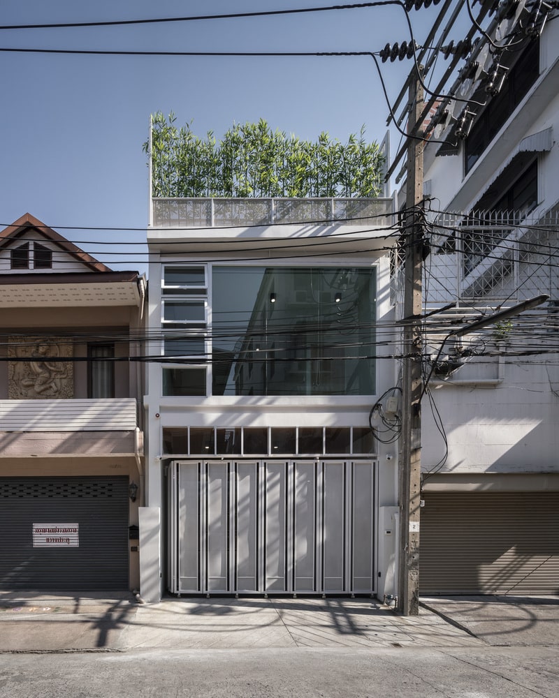
Enter the IN-SIGHT House located in Thailand, which is an example of a townhouse done right. Originally, it is an existing three-storey townhouse that did not have enough space but luckily, TOUCH Architect managed to convert it into a bright and airy home for a couple with a baby.
Project: IN-SIGHT House
Architect: TOUCH Architect
Location: Thailand
Exterior Area:
Concept:
To fulfil this brief, they needed to create more space and improve on the ventilation, so that the natural light and air can enter the home. The home consists of six simple boxes, where three of them are from the original structure while another three was added as an extension located at the front part of the building to create more space.
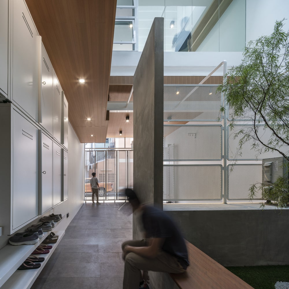
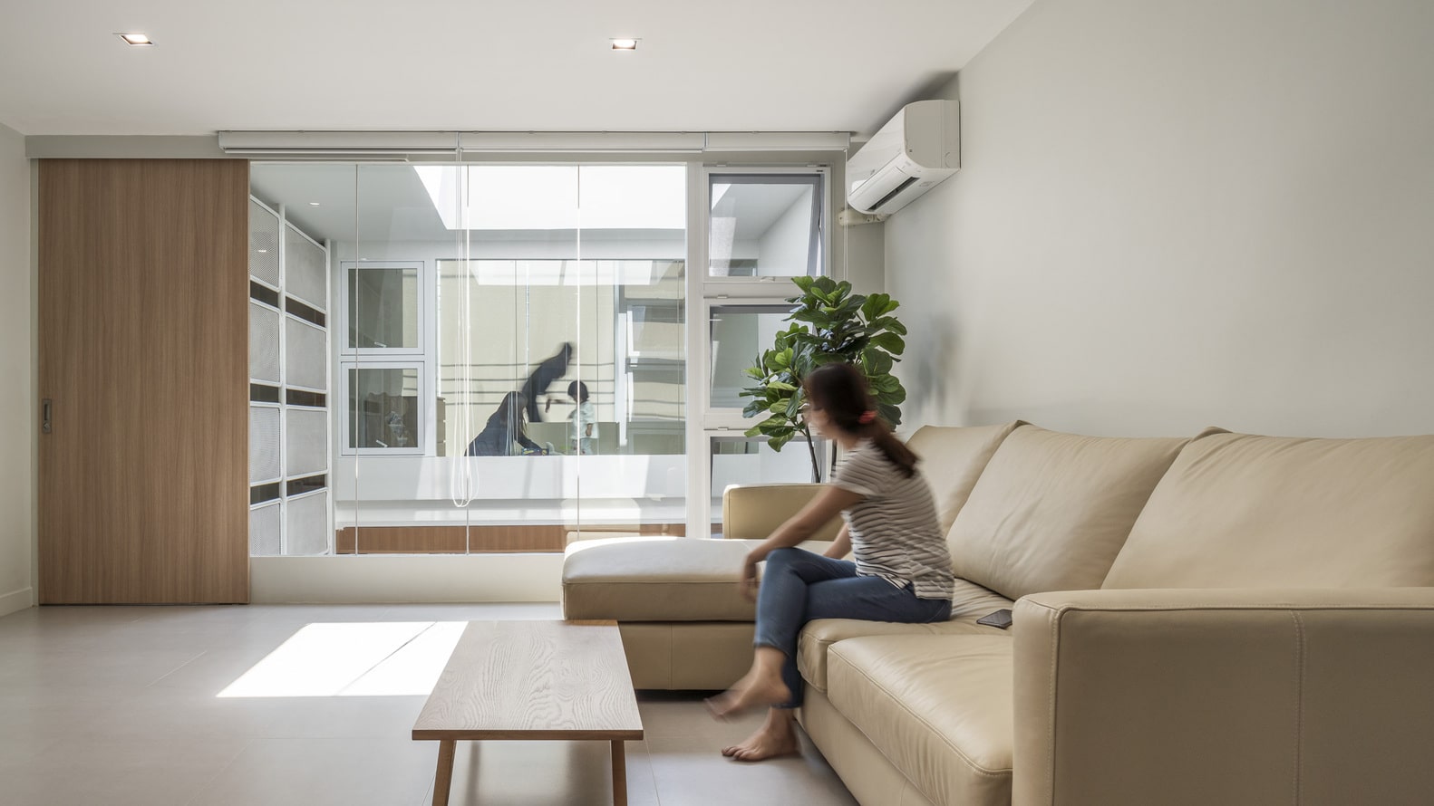
These extra boxes allow the architects to add a courtyard on the ground floor, which opens up the interior. The courtyard enhances ventilation and can be seen from the foyer, first floor living area, second floor family room and the second floor activity room.
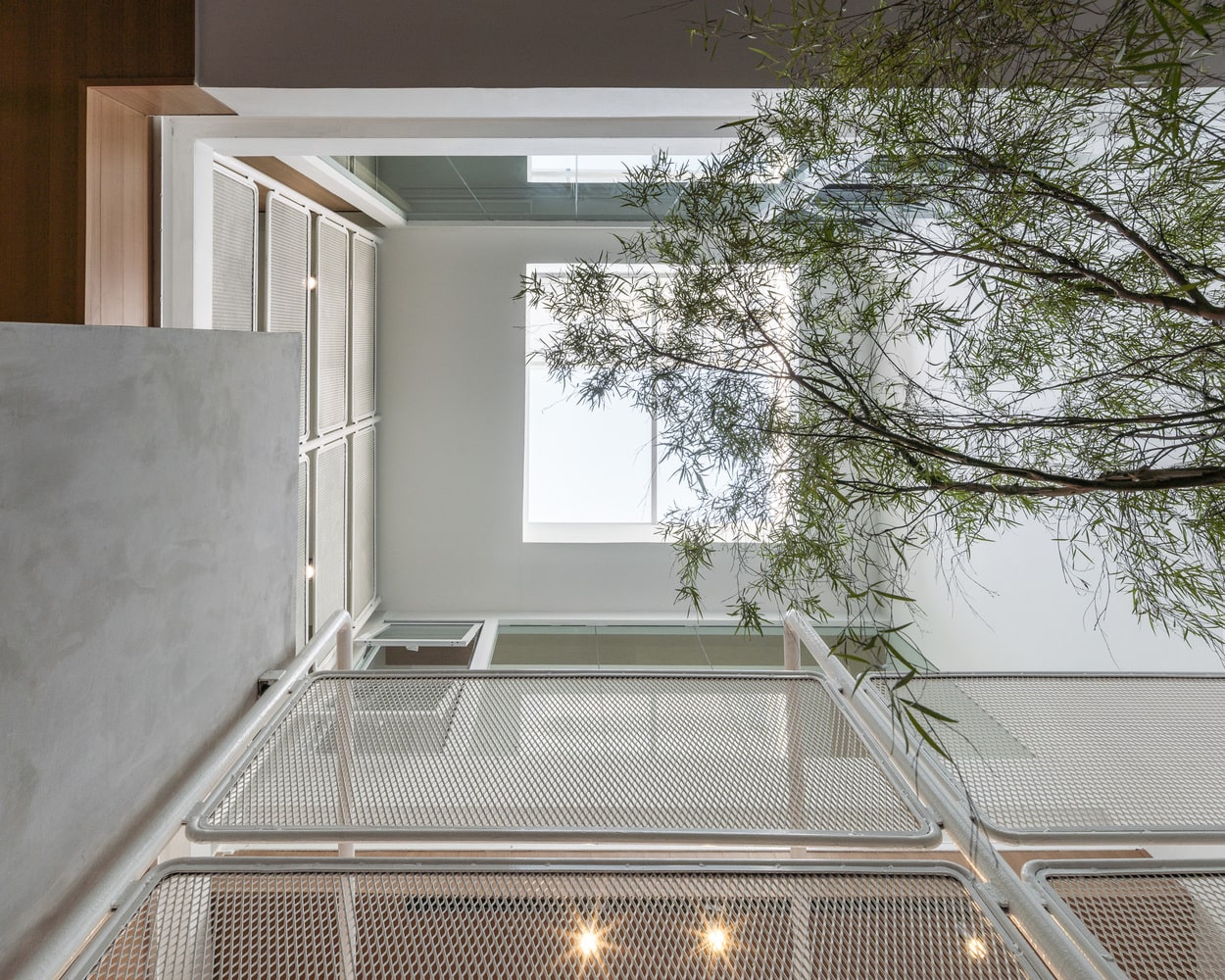
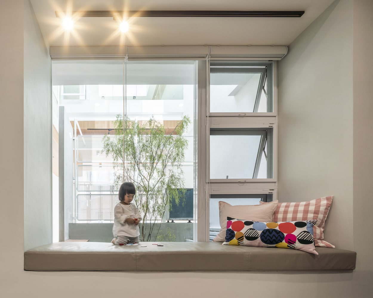
Another of the added boxes are located on the second floor and is used as an activity room. This box is elevated to create a dynamic space and is designed to allow the parents to keep an eye on their baby even when they are in another room.
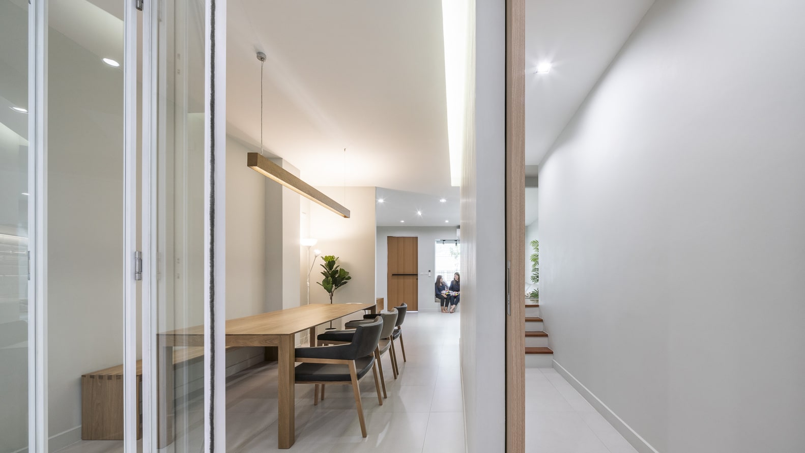
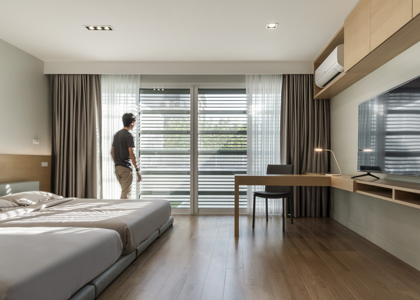
To facilitate bonding and improve circulation, the spaces inside the house are linked cohesively. The third floor is kept private as the master bedroom is situated here and is blocked by the extension’s high rooftop.
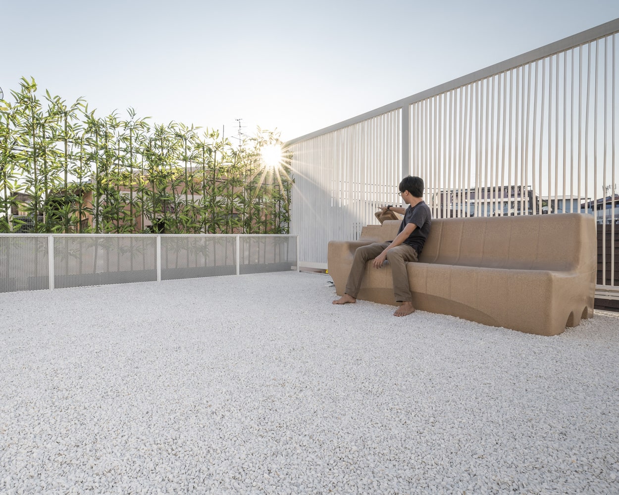
This rooftop connects directly to the master bedroom and is used as a private garden, so the residents can enjoy the view.
Decor:
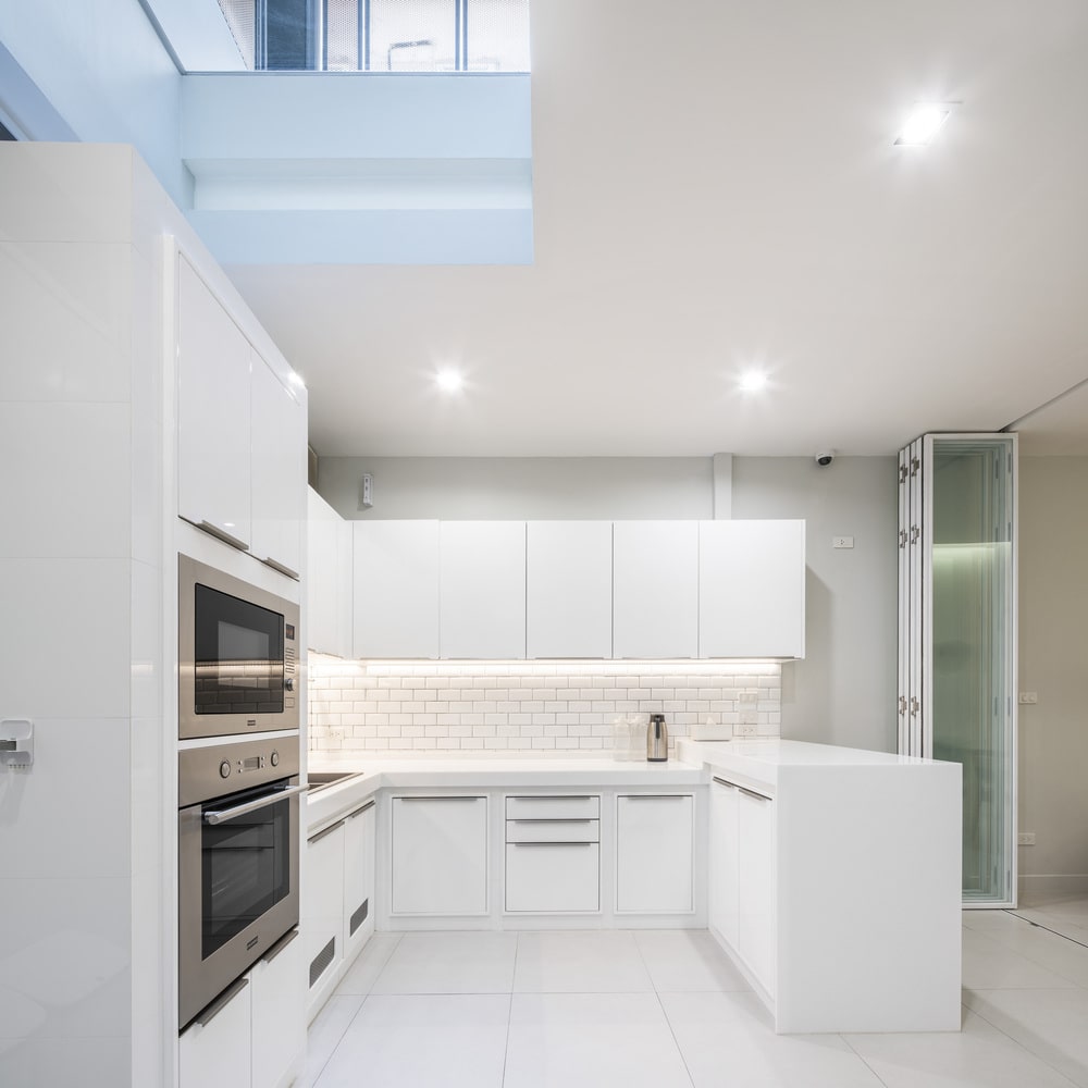
The architects added two skylights in the kitchen and courtyard to brighten up the dark interiors. Expanded and perforated metal is used to create the facade, which looks stylish while increasing the safety and privacy of the home.
The interior decor of the home focuses on minimalist and modern elements, using white as the main colour palette and is complemented with warm neutrals such as beige, cream and brown for its fixtures and fittings.
All images are taken from TOUCH Architect unless otherwise stated.
Interested in more amazing house designs? Check out our collection of house design articles now.
