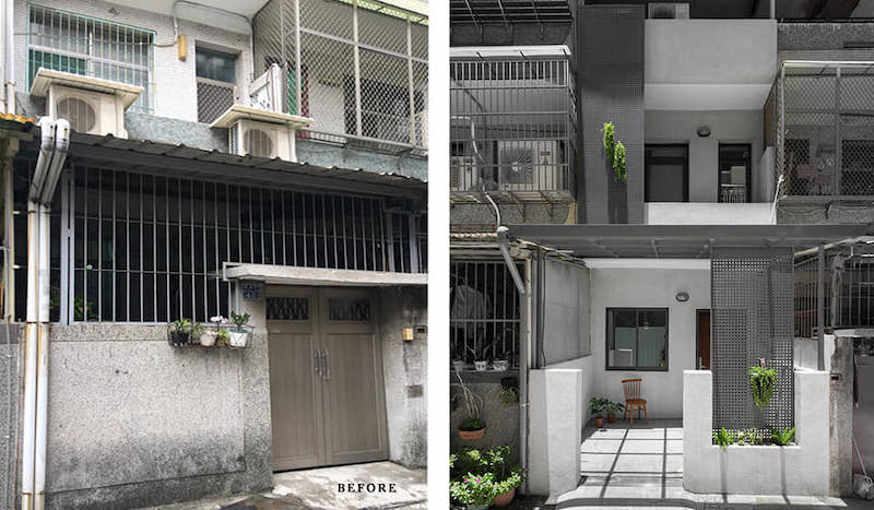
To preserve the integrity and character of this fifty-year-old home, these architects borrowed influences from contemporary architecture and minimalism, to renovate it.
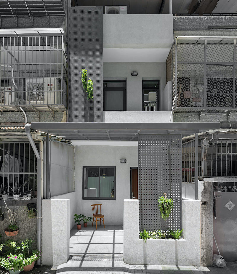
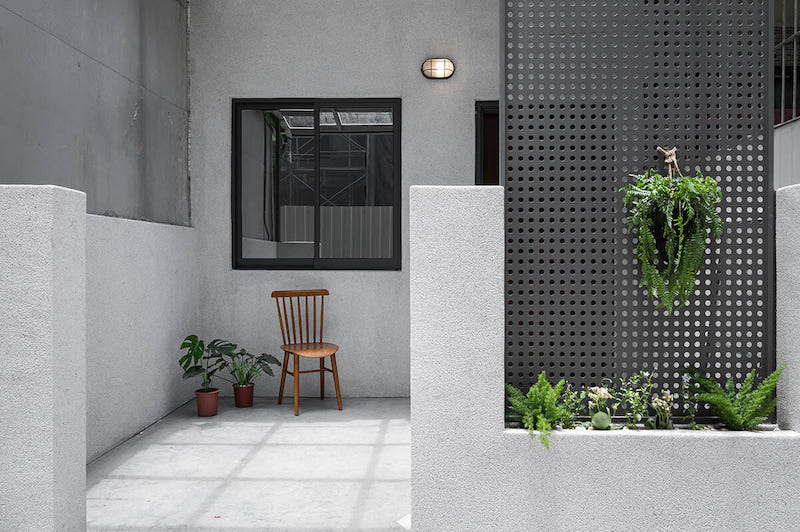
The haphazard, unappealing facade was designed into a balanced interplay of white punctuated with trellises where plants could flourish. The enclosed garage was opened into an open-to-sky patio and car porch.
Exterior Area:
Interior Design:
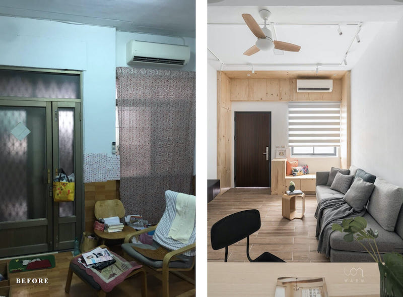
The cluttered, cramped living room with mismatched materials and furniture was transformed into a brightly lit, inviting space.
The blue walls were repainted a bright white, and the metal frames were replaced with beautifully-crafted, deconstructed wooden architraves.
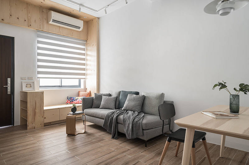
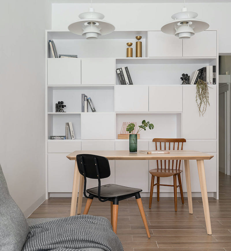
Storage shelves in a delicate white, a wooden study table, and a cool-gray sectional tie the living room together.
Simple details like a window seat beneath the window with extra storage, take the space up a notch.
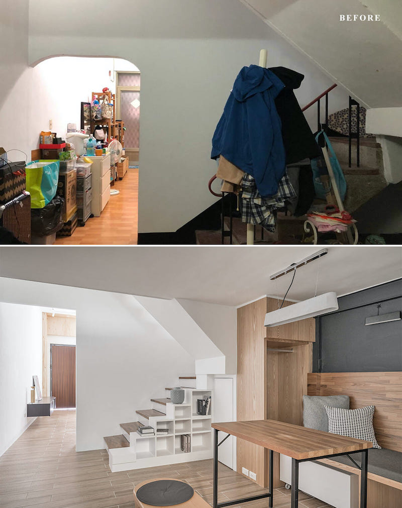
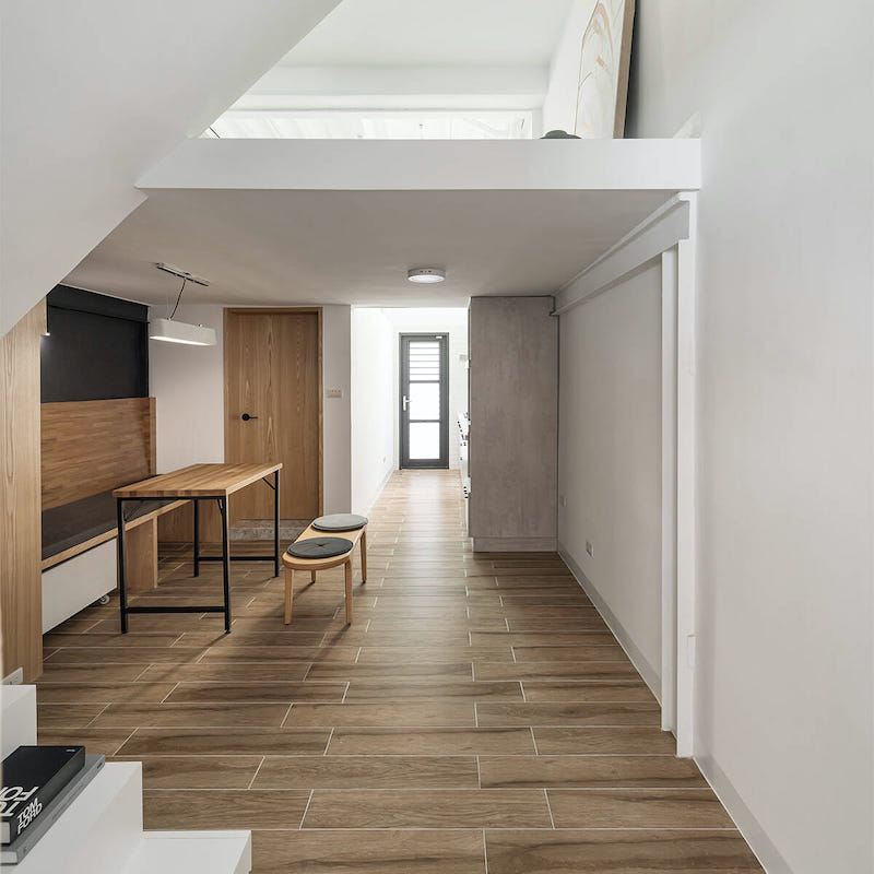
The transition space between the living area and kitchen, which was being used as an overflowing storage space underneath the staircase, was converted into a cozy dining area with concealed storage spaces in the stringer.
The dining area features a running wooden bench on one side and seating with in-built cushions on the other.
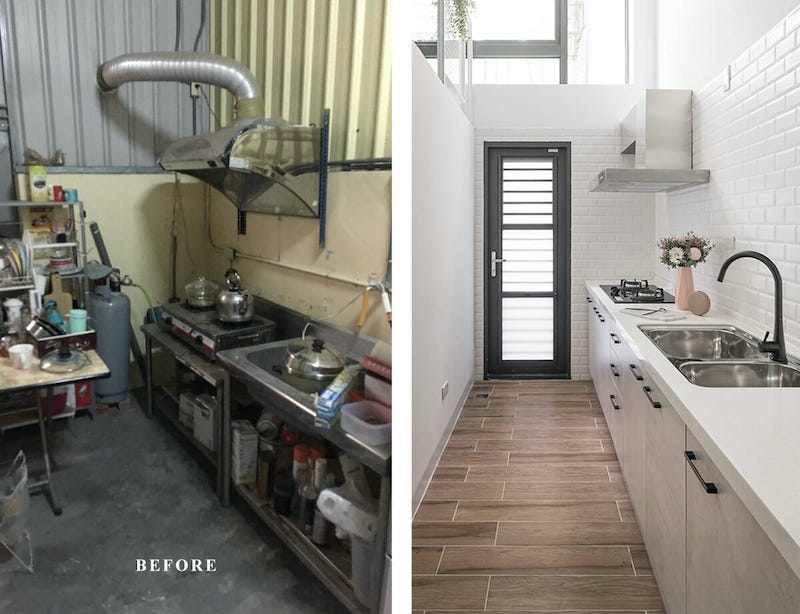
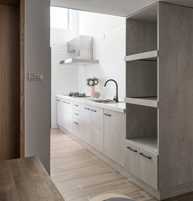
The dark, bestrewed kitchen received a drastic change so that it would be more functional.
The white-painted brick surfaces and the perforated wall opposite add a delightful airy charm to this space.
The wooden flooring and polished gray cabinets with white swirls are a refreshing contrast to the white.
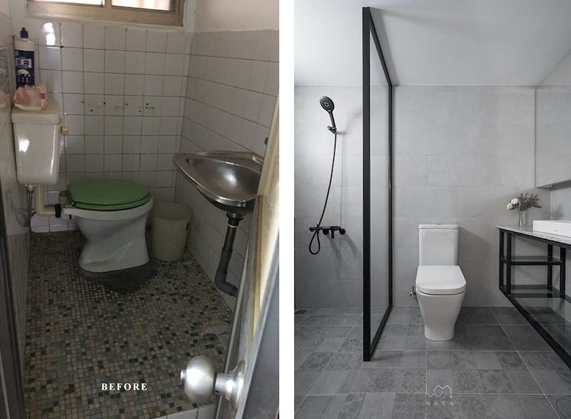
From a dark and dingy space, the common bathroom was elevated into a clean, crisp, and bright space with a color palette of gray, white, and black.
The subway tiles, mosaic flooring, and mismatched fixtures were replaced with ash gray tiles, printed vitrified tiles, and white fixtures, respectively.
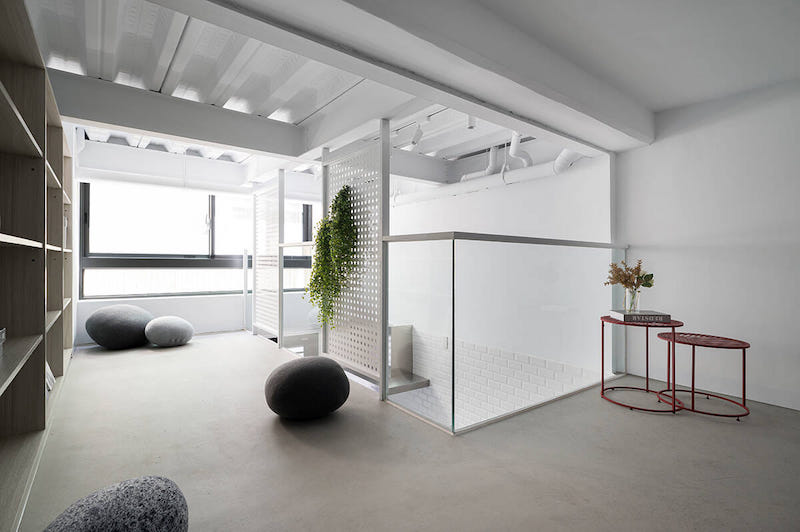
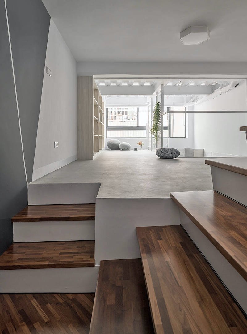
A mezzanine floor was added to create a multifunctional area, where the family could spend some time together and relax.
A polished concrete floor reflects the natural light pouring in through the wide window, making it a cozy haven for reading. Rock-shaped poufs are peppered throughout creating the perfect reading atmosphere.
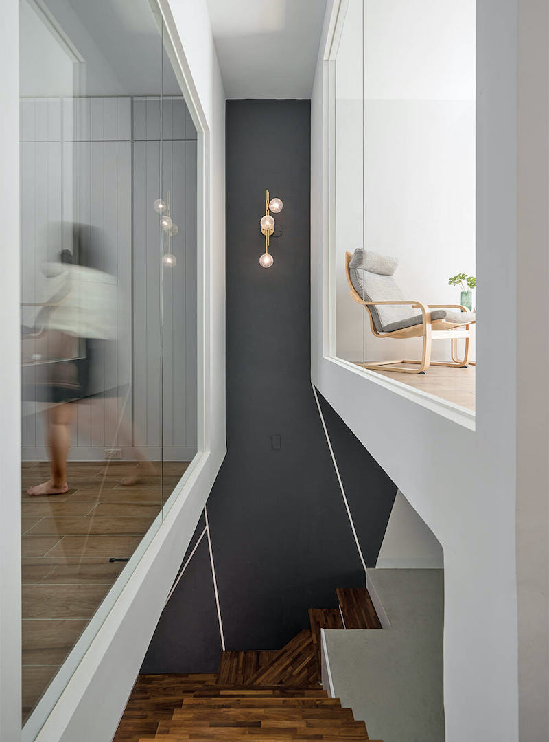
The staircase then leads up to the bedrooms on the first floor, where it bifurcates into two.
The stairwell has been designed as a gallery-like space, with a black accent wall punctuated by sleek white stripes.
This contrasts the white frame of the glass-fronted bedrooms, which have a visual connection with the staircase.
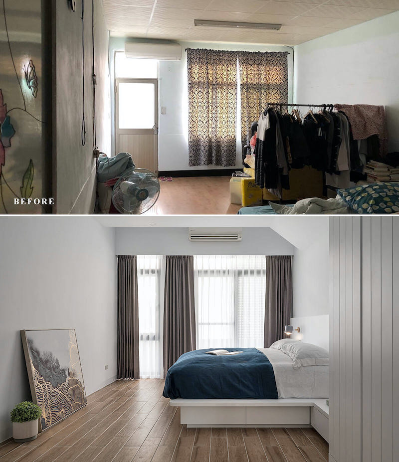
The spatial configuration of the primary suite was enhanced to make it more spacious and well-suited to the daily activities of the residents.
A large, full-length window pours in diffused light through tulle, double-layered curtains.
Dark color schemes were swapped out for white, to give the illusion of a more spacious area. Drawers beneath the bed supplement the storage space offered by the wardrobe.
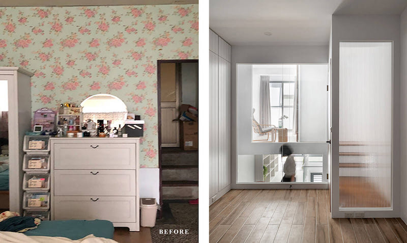
The master bathroom has clearly defined wet and dry areas and follows a classic color palette of gray, white, and black accents. It has a clean, crisp look, whereas the full-length mirror makes the space look larger.
Before it was renovated, this house in Taiwan felt like a “long, dark train” as described by the owner.
Materials and color coordination make a huge difference in interior design, and this home sets the precedent for impressive renovation projects.
Interested for more amazing house designs? Check out our collection of house design articles now.


