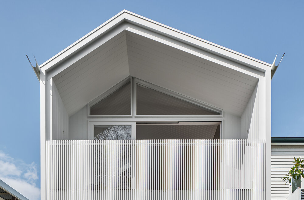
Highlighted by a charming background of vernacular, detached homes, the One Plus One House in Paddington, Brisbane is a clear, geometric representation of turn-of-the-century architecture.
With a white square prism gently poised over the existing, high-set timber cottage, the renovation project aims to provide more living space and a better connection to the backyard.
Project: One Plus One House
Designer: Refresh Design
Location: Australia
Concept Design: 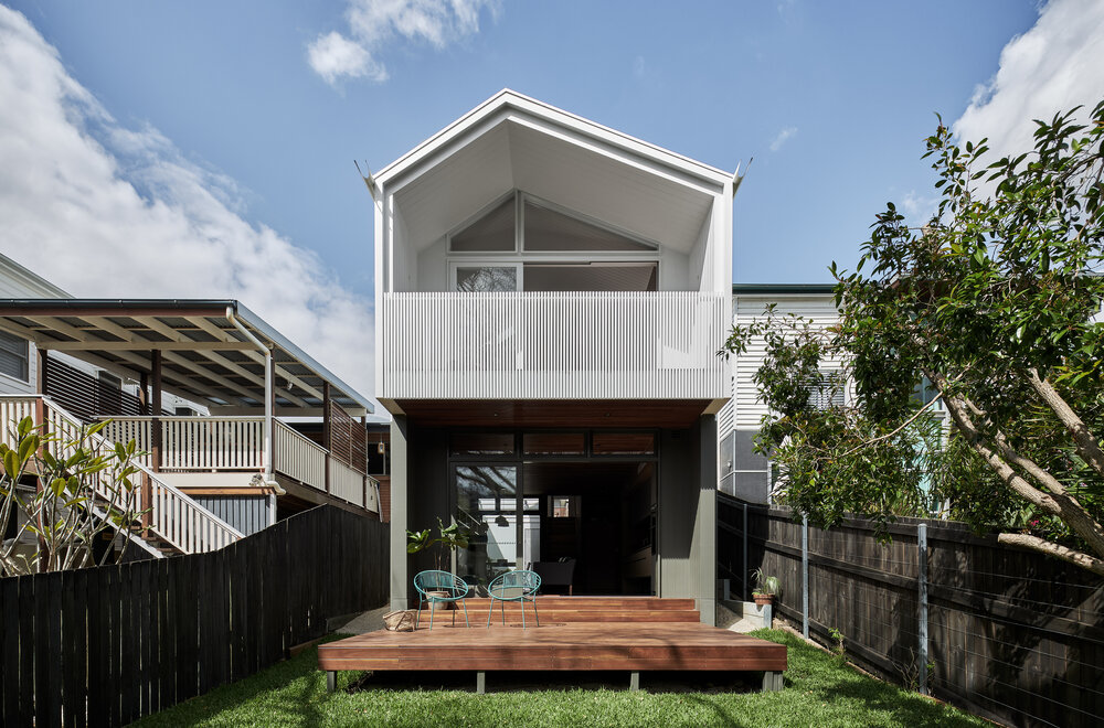
The spatial configuration was planned around the contours of the site, which meant that the entrance to the house would be at a higher level.
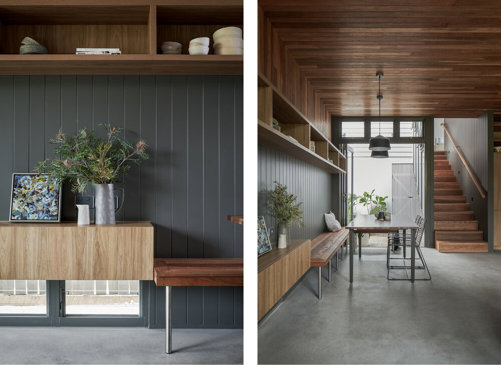
A living room, dining area, and kitchen all laid in an open floor plan comprise the lower ground floor. Polished concrete floors, compressed, grey fiber-cement sheets for the walls, and cover battens in a warm wooden texture define the spaces on the ground floor.
The living room has a direct connection with the backyard which was previously hard to access.
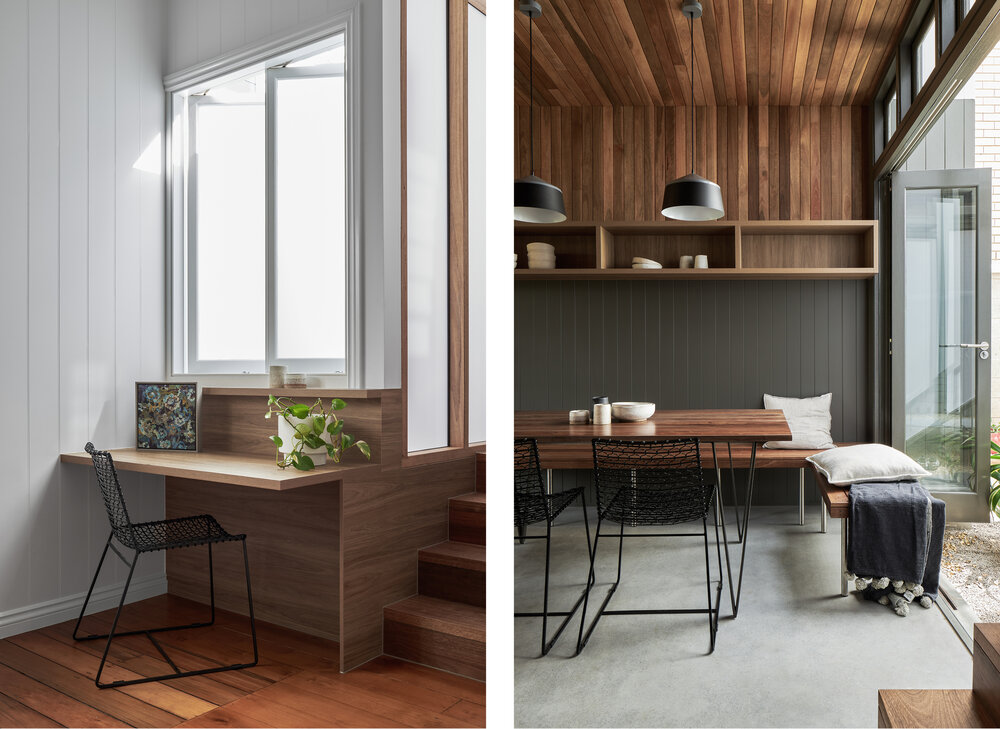
A series of strategic openings like casement windows and large, retractable glass doors offer privacy while seamlessly blurring the boundary between the indoors and outdoors.
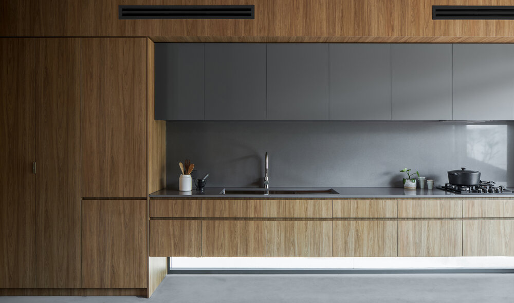
The kitchen is a symphony of a gray and warm brown color palette.
The coolness of the matte-gray cabinets and glossy-gray backsplash and countertops cuts through the warmth of wood-clad kitchen interiors and false ceiling.
A narrow, floor-level opening skirts the bottom of the kitchen workspace, filling the space with diffused light.
Opposite the kitchen is a cozy dining area, whose cool-gray cover battens seamlessly transition into the wood to create a charming balance. It opens out into an open-to-sky, pebble-lined courtyard that is connected to the utility area.
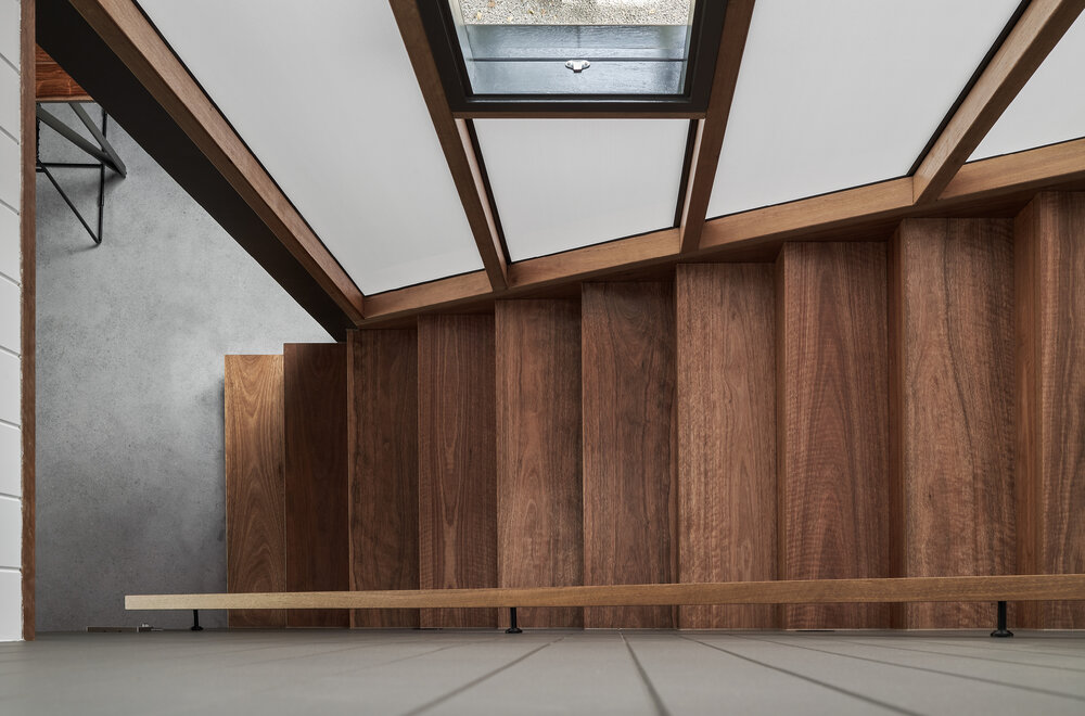
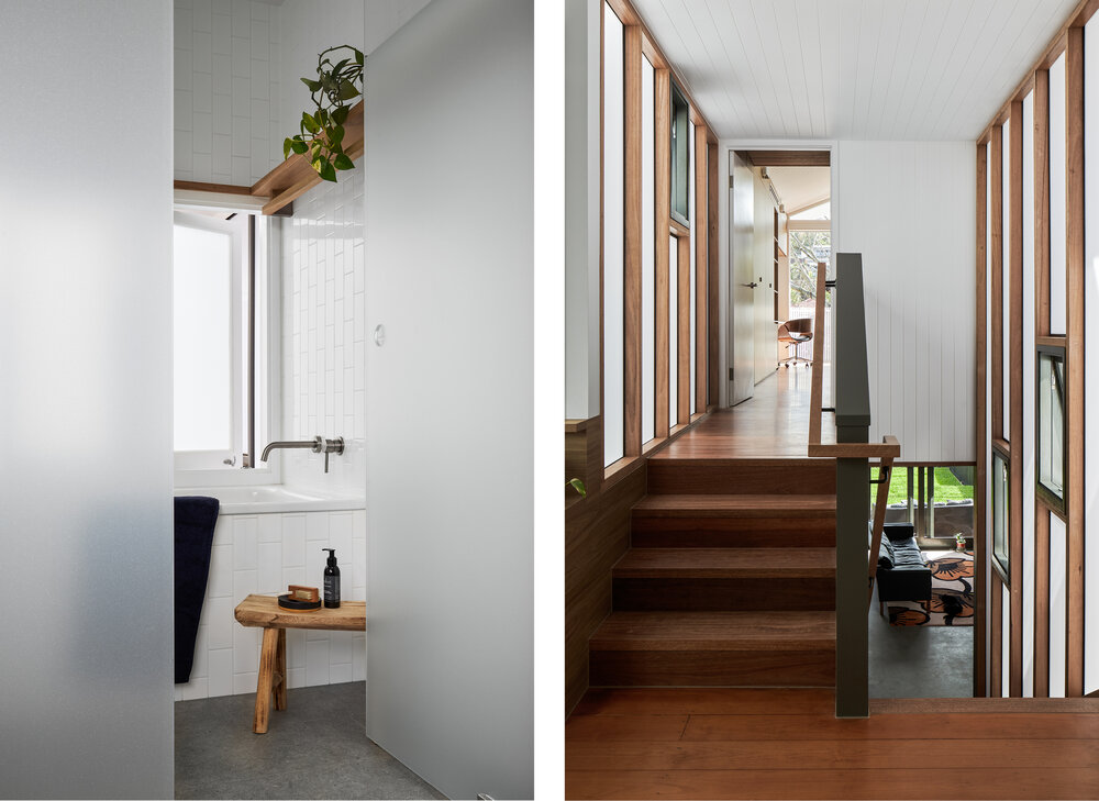
Wooden stairs extend from the lower ground floor to the ground floor, creating a link between the old and new cottage and establishing two internal courtyards.
The staircase is flanked with translucent, pearly-white Danpalon paneling which pours in diffused light into the stairwell.
It opens out into a formal living room, study, and guest bedroom. The previously dark core of the cottage now allows natural light to pour into both volumes.
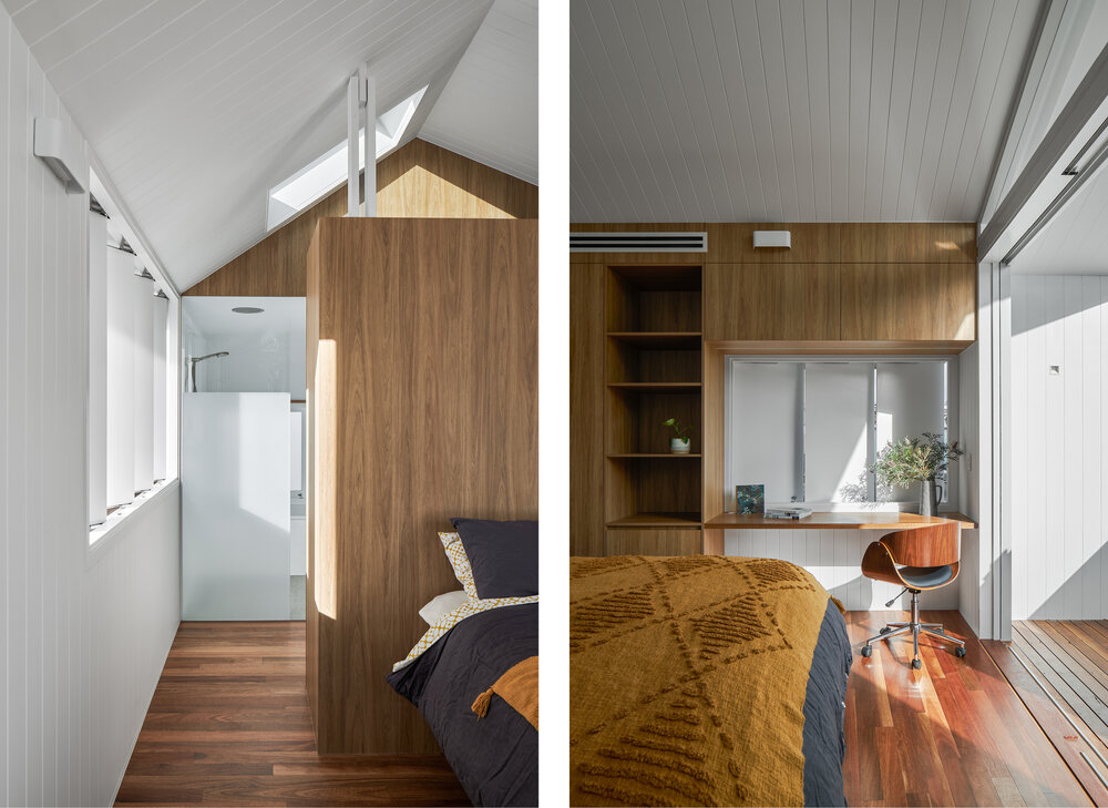
To take complete advantage of the contours, the master bedroom is set at a slightly higher level, facing the backyard.
A skylight in the gable roof and the minimal color scheme, making the bedroom spacious, bright, and warm.
The wooden flooring beautifully contrasts the white battens of the ceiling, whereas the exposed-wood shelves add a tinge of the vernacular aesthetic.
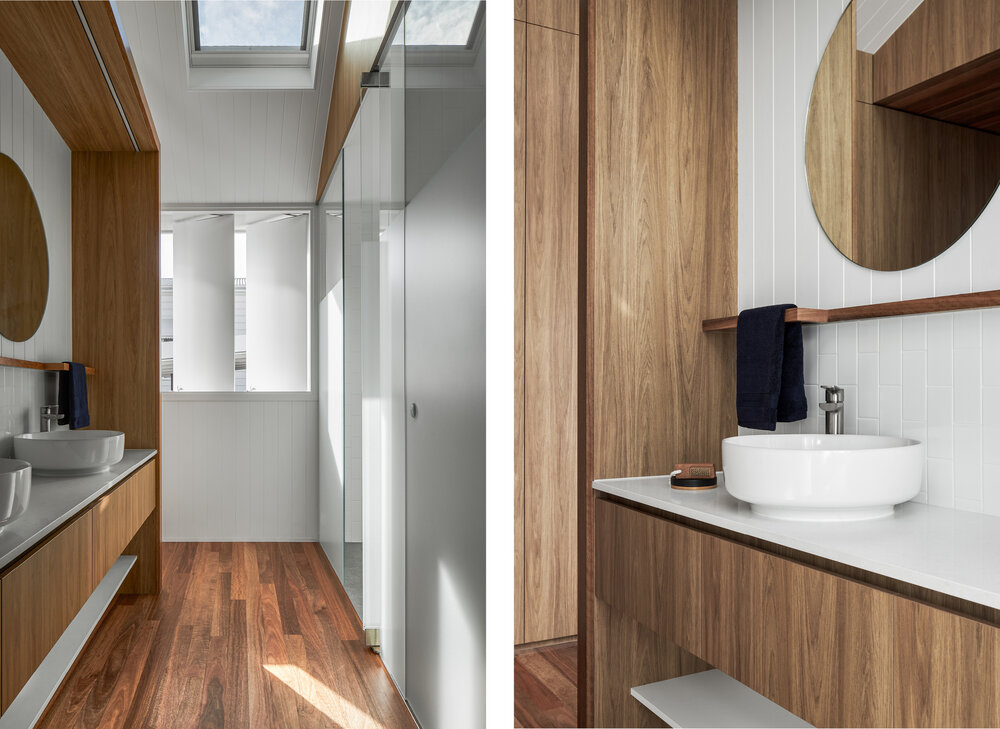 The master bathroom reflects the conceptual mood board of the bedroom, with a refreshing palette of glossy white and matte gray, paired with wooden accents.
Its crisp, clean, and refined design enhance functionality and highlight the fine craftsmanship of the architectural studio.
The One Plus One House bridges the gap between contemporary and vernacular design, not only in terms of spatial configurations but also in the materials used.
By optimising the zoning and making excellent use of site contours it stands tall against the azure sky as an example of how simple tweaks can truly bring out the beauty of two distinct architectural styles.
All images are taken from Refresh Design unless otherwise stated.
Interested for more amazing house designs? Check out our collection of house design articles now.


