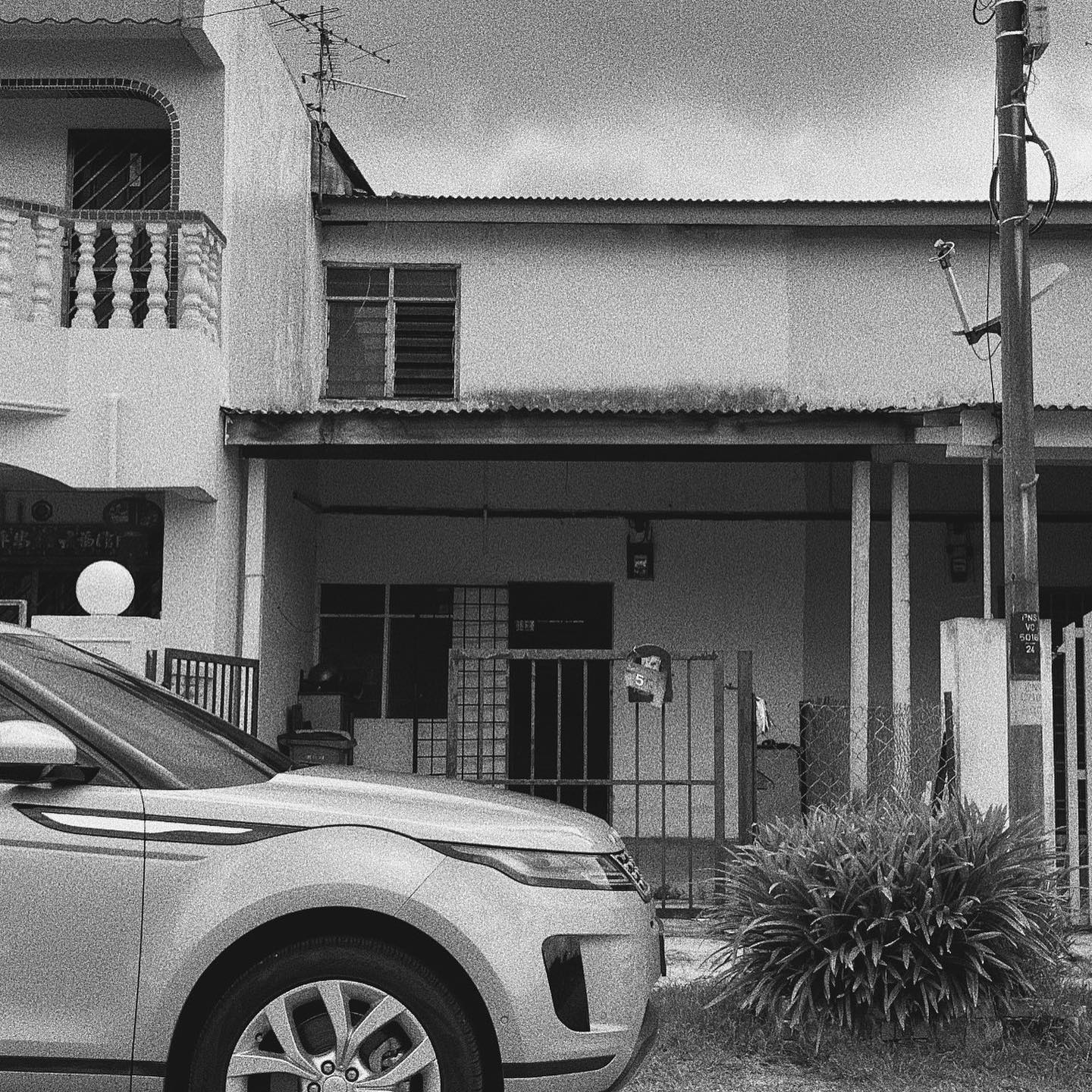
In Singapore and Malaysia, aging terrace homes from the sixties are receiving a brand new, modernistic look. Keeping up with this trend, a compact, 825 square foot house in Johor Bahru, Malaysia was refurbished by Supernormal Design Studio.
Designer: Supernormal Design Studio
Location: Malaysia
Before:
After:
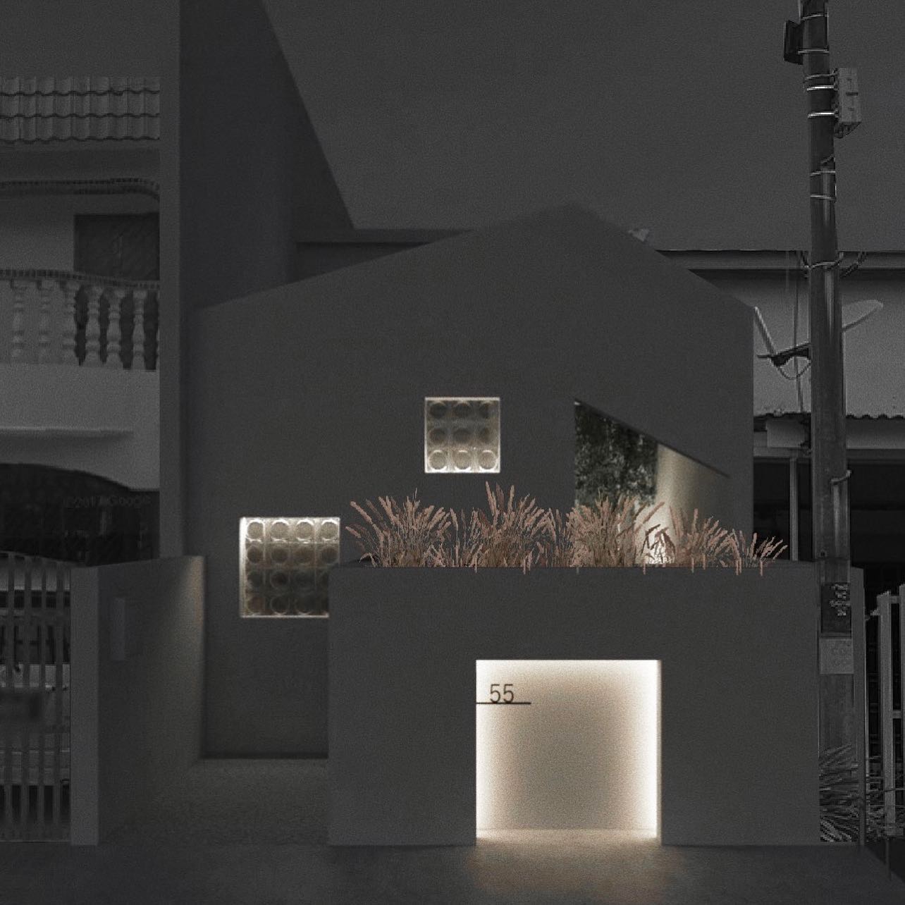
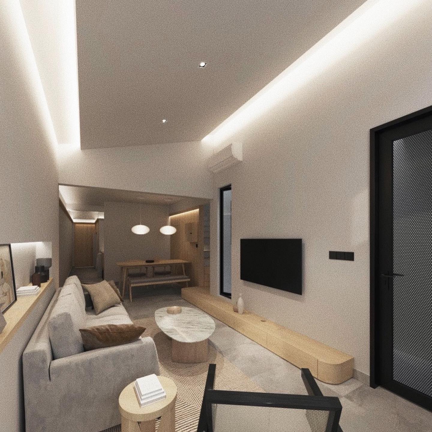
In the living room, the wall segregating the space from the kitchen was demolished, to make way for an open floor plan. At the same time, natural light pours into the interiors through the newly enlarged windows.
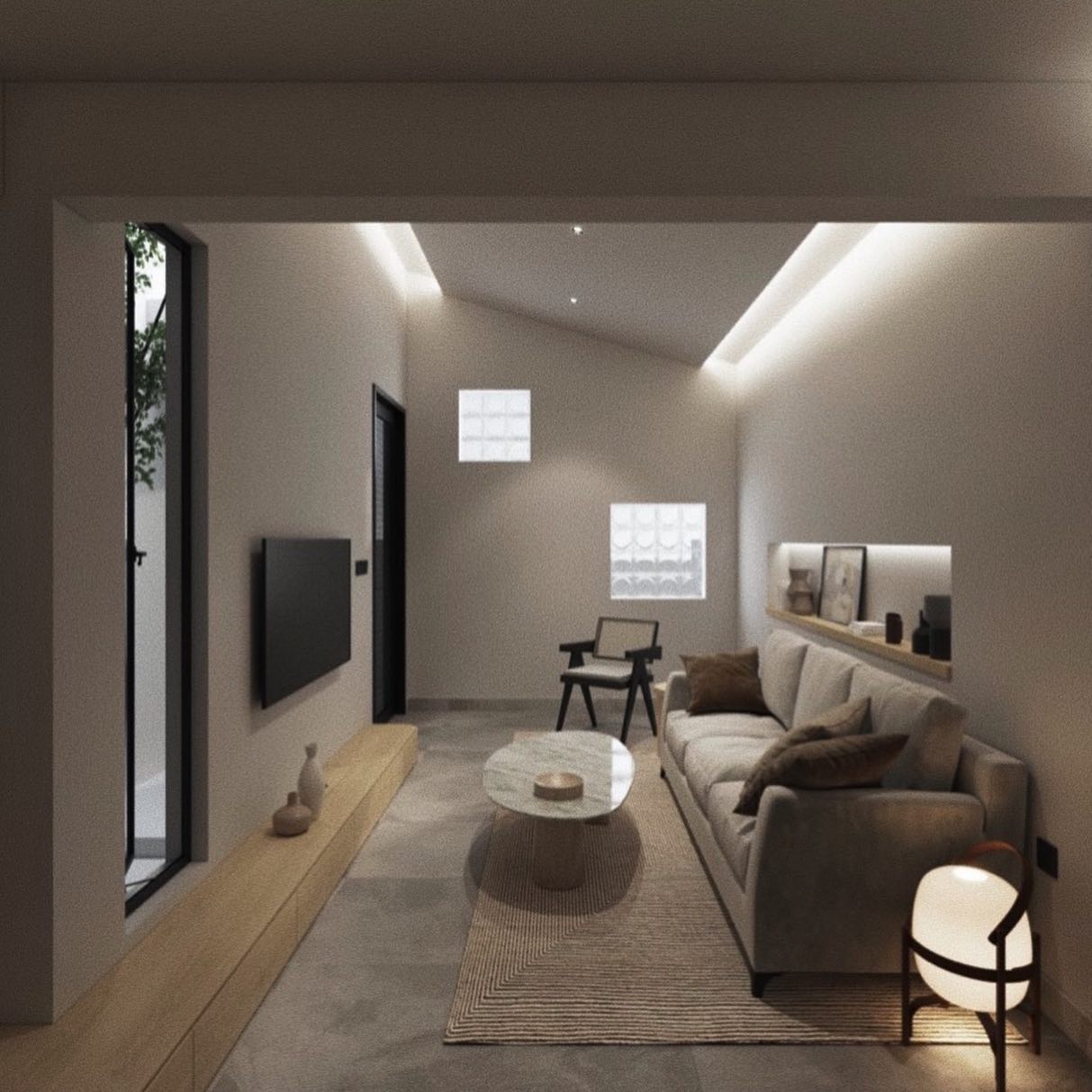
At night, the reverse cove lighting in the living room directs the visual flow of the residence towards the rear of the house, adding to the illusion of volume. The TV too was mounted on the wall with a sleek, exposed wood platform running below it.
To create clutter-free, minimalistic interiors open shelving spaces were replaced with subtle, more concealed options, like an alcove directly behind the sofa.
A small platform beneath the window has built-in cabinets that offer ample storage space for household essentials and other decors.
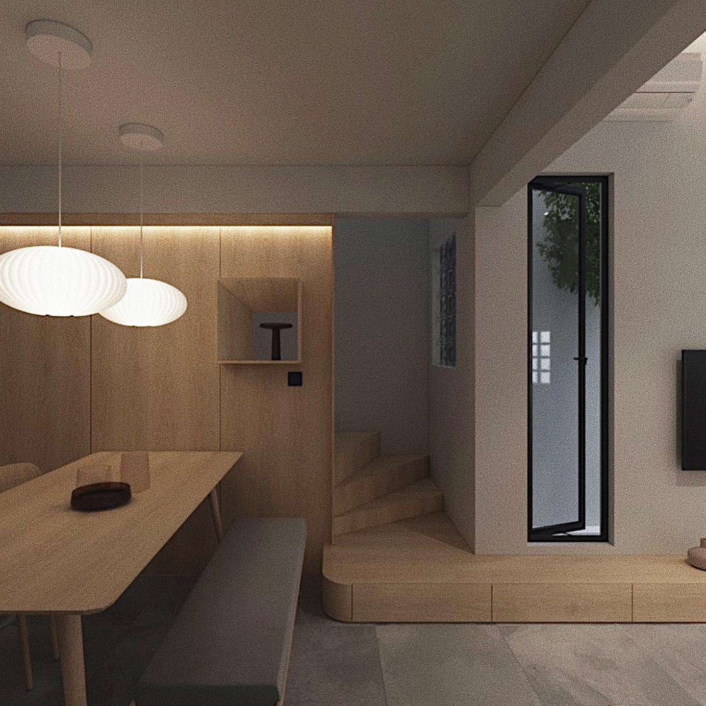
A round dining table would have cut down the already compact carpet area, and so a long, rectangular pinewood table with matching benches was used.
More storage space has been subtly incorporated in this area, with concealed, lightwood panelled shelving. A relaxing, diffused glow at dusk is created by two spherical pendant lamps that hang over the dining table.
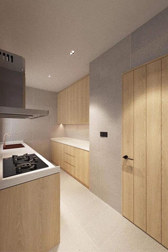
The light grey flooring tiles and lightwood paneling in the kitchen complement each other in a gorgeous medley. The white countertop adds to the visual appeal of the kitchen while boosting functionality.
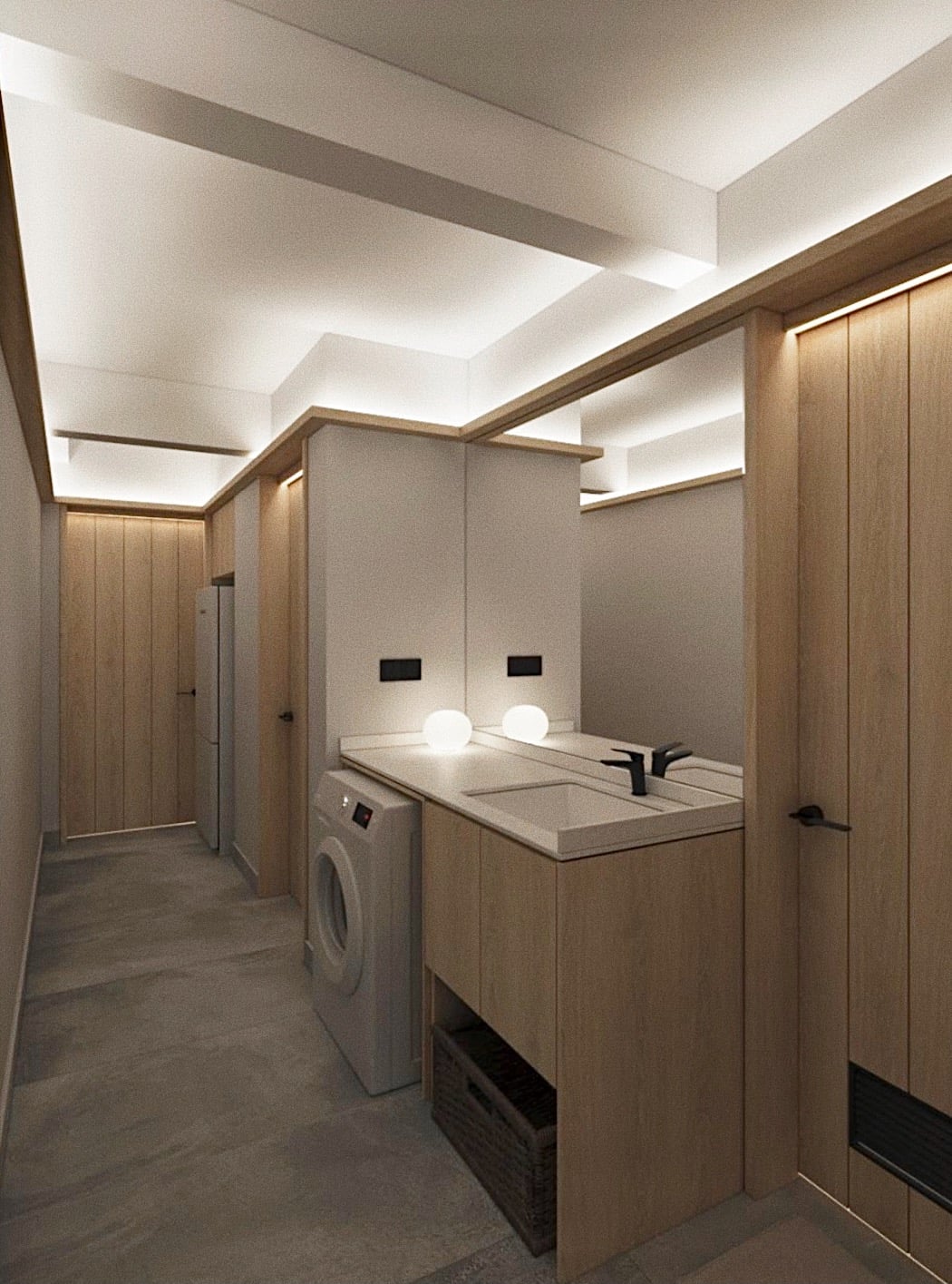
A small yard area next to the kitchen has a sink, and also offers the required storage space for appliances. Contrary to the harsh lighting that’s typically used in utility areas, the design team opted for concealed LED track lighting, for a softer look.
The earthy and light color palette chosen for the interiors creates a tranquil, inviting ambiance, and also creates the illusion that the space is much larger than it actually is.
While cream-based tones have been used throughout the residence, a splash of black on the frames and armchair creates a wonderful, monotony-breaking contrast.
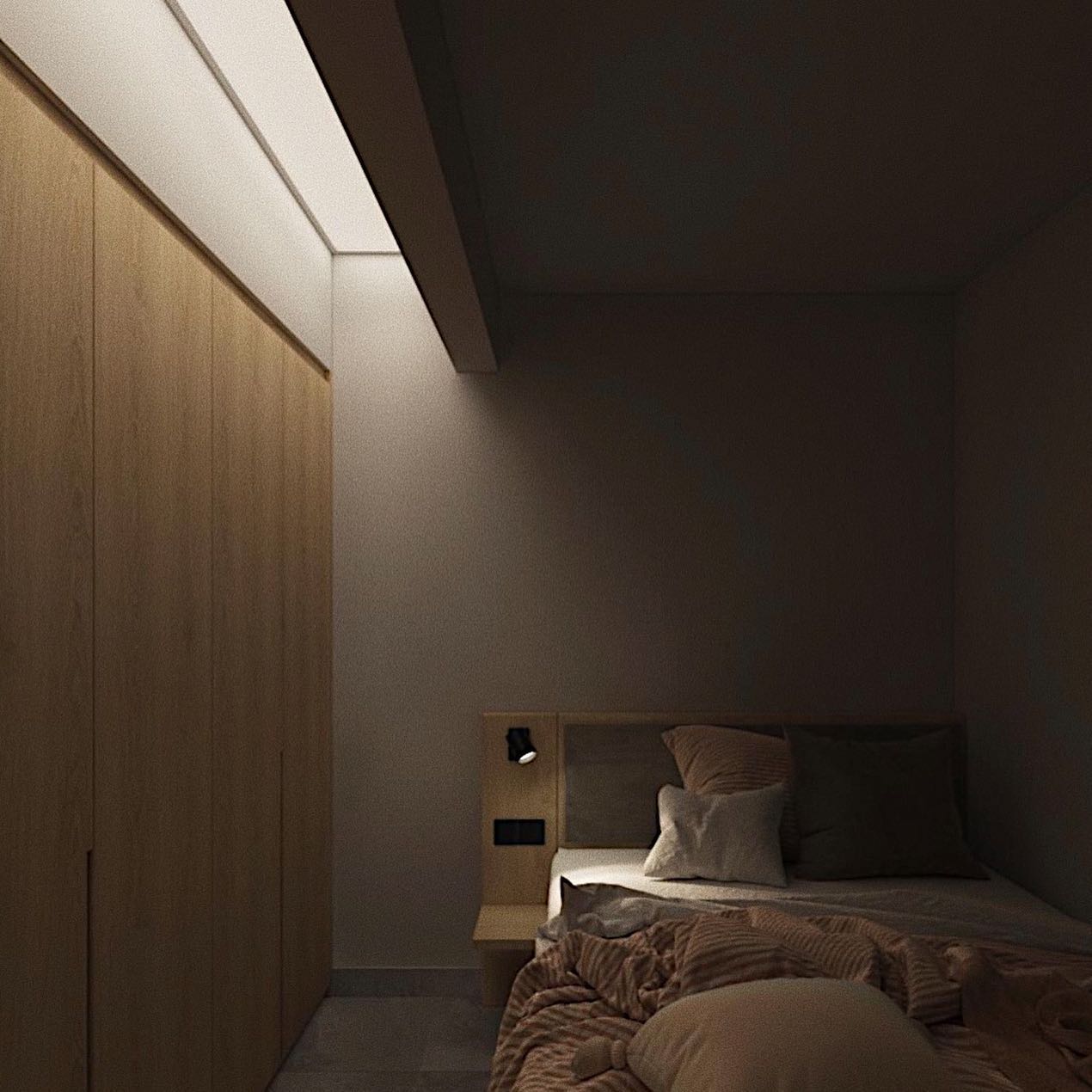
The first floor has the master bedroom, where a row of recessed lights draws attention towards the wardrobe. The lighting design in the bedroom was done in a way to avert glare from the sleeping area, hence keeping it cozy and relaxing.
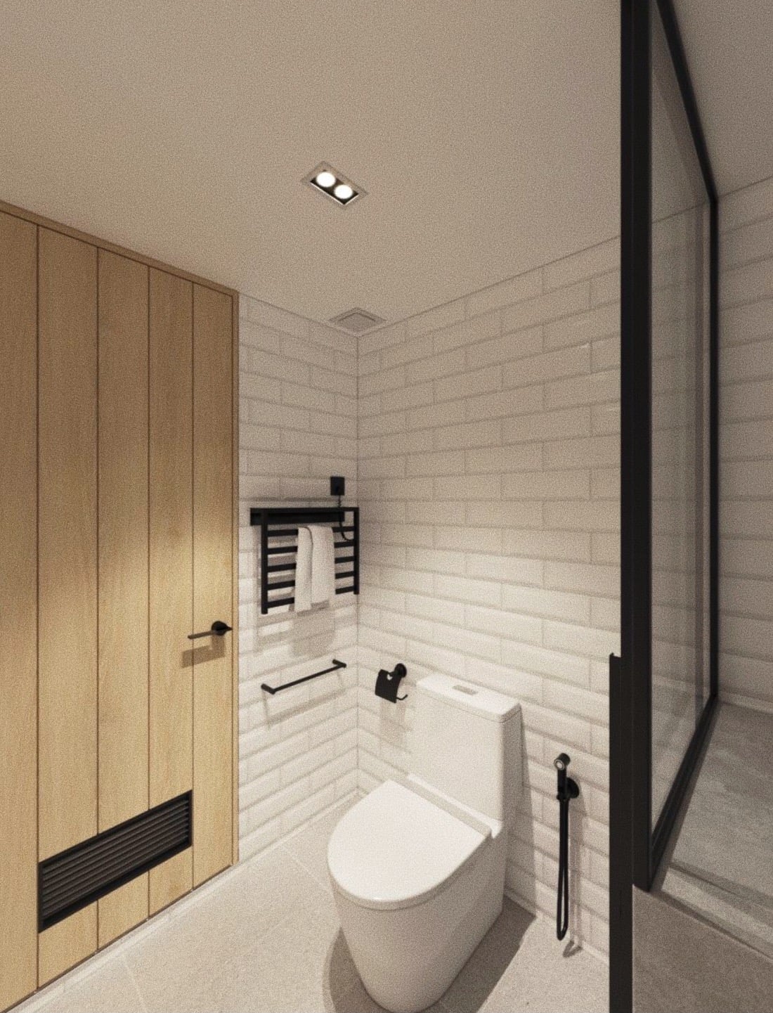
Keeping up with the functional minimality of the house, a simple built-in headboard, and side table flank the bed, to make optimal use of the narrow room. The master bathroom features white subway tiles whose modernistic beauty is augmented by black frames and fixtures.
By making creative, yet subtle interior changes, this existing terrace house was revamped into something extraordinary. By aligning their renovation goals to primarily improve the functionality and interior elements of the home, the design team proved that beauty doesn’t have to come at an extravagant cost.
All images are taken from Supernormal Design Studio unless otherwise stated.
Interested for more amazing house designs? Check out our collection of house design articles now.


